How to create a self-sizing gauge component in SwiftUI
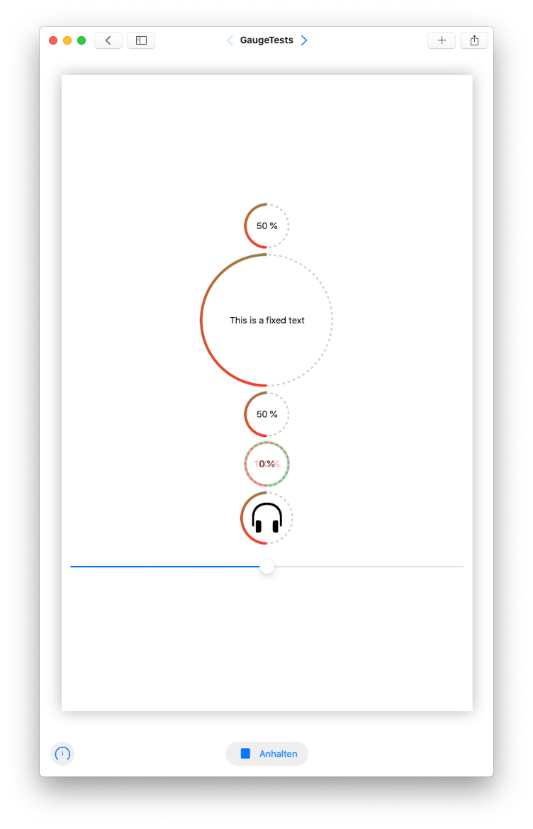
SwiftUI is really great and building custom UI is actually pretty straight forward. Let's use function builders and preference keys to build a component that looks like this:

The gauge features a center view that the user can either provide or the gauge will automatically show a text presenting it's value. So once we have our gauge component ready it can be used like this:
// Simplest use possible, the Gauge will construct a centerView that shows: '\(value) %'.
// To prevent constant resizings when passing in other values the centerView width is calculated
// from the string: '100 %'
Gauge(value: value)

// provide your own centerView.
Gauge(value: value) {
    Text("This is a fixed text")
}

// use an image
Gauge(value: value) {
    Image(systemName: "headphones")
        .resizable()
        .frame(width: 55, height: 55)
}
The gauge will automatically adjust its size depending on the size of the center view.
How is this built?
import SwiftUI

public struct Gauge<T>: View where T: View {
    let centerView: T
    let value: Double

    let thickness: CGFloat = 5
    let scale: CGFloat = 1.777

    let gradient = AngularGradient(
        gradient: Gradient(
            colors: [
                .red,
                .green
            ]
        ),
        center: .center
    )

    @State private var diameter: CGFloat = 0

    public init(value: Double, @GaugeBuilder builder: () -> T) {
        self.value = value
        self.centerView = builder()
    }

    public var body: some View {
        ZStack {
            centerView.background(
                GeometryReader { proxy in
                    Color.clear.preference(key: GaugeWidthPreferenceKey.self, value: proxy.size.width)
                }
            )
            Group {
                Circle()
                    .stroke(Color.primary.opacity(0.2), style: .init(lineWidth: thickness/scale, dash: [5]))
                Circle()
                    .trim(from: 0, to: CGFloat(value/100))
                    .stroke(gradient, style: .init(lineWidth: thickness))
            }
            .padding(thickness/2)
            .rotationEffect(.degrees(90))
            .frame(width: diameter, height: diameter)
        }.onPreferenceChange(GaugeWidthPreferenceKey.self) { width in
            self.diameter = width * self.scale
        }
    }
}

extension Gauge where T == ZStack<TupleView<(Text, Text)>> {
    public init(value: Double) {
        self.value = value
        self.centerView = ZStack {
            Text("100 %").foregroundColor(.clear)
            Text("\(value, specifier: "%.0f") %")
        }
    }
}

@_functionBuilder
struct GaugeBuilder {
    static func buildBlock<T: View>(_ centerView: T) -> T {
        centerView
    }
}

struct GaugeWidthPreferenceKey: PreferenceKey {
    typealias Value = CGFloat
    static var defaultValue: CGFloat = 0

    static func reduce(value: inout CGFloat, nextValue: () -> CGFloat) {
        value = nextValue()
    }
}
So that's the complete thing. There are a few things worth mentioning.
Function Builder
This is the magic behind the nice SwiftUI DSL. The buildBlock function returns what gets passed as the trailing closure to the Gauge. So instead of this:
Gauge(value: value, centerView: Text("\(value) %")
you can write:
Gauge(value: value) {
    Text("\(value) %")
}
Preference Key
In SwiftUI preference keys provide the possibility for a child view to pass values up to it's ancestors. While @Environment-objects are visible to child views, PreferenceKeys are visible to parents. What we want to achieve is that the Gauge knows the width of it's centerView and adjusts the circles accordingly. So we add the .background-modifier to the centerView and fill its background with a transparent color. We use the GeometryReader's proxy to get the size of the invisible Color and save that in the GaugeWidthPreferenceKey.
Now we can use the .onPreferenceChange-modifier on the outer ZStack to calculate the diameter of our circles. Since diamater is a @State-property the body property of the Gauge will be evaluated and our circles are drawn with the desired diameter. Very cool!
Providing a default center view
There's one more thing required to make the Gauge work without the need to provide a centerView. We need an initializer that takes only the value as an argument. This can be done with an extension of the Gauge using conditional conformance.
Why conformance to ZStack<TupleView<(Text, Text)>>?
In order to prevent the Gauge to change its size with every different value between 0 and 100 % I build a default centerView that has the invisible string "100 %" and centered on top of that the string representing the actual value. So the centerView will always have the same width.